I Roasted 7 SaaS Landing Pages With AI — The Same 5 Mistakes Everywhere
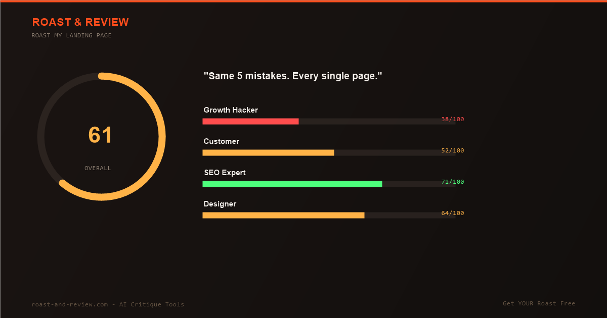
I fed seven real SaaS landing pages through our AI audit engine — the same engine that powers our free landing page roast. Some are household names. Some scored above 90 out of 100 overall. And yet every single page made the same five conversion-killing mistakes.
The lesson is uncomfortable: looking polished and converting well are two different skills. Here are the seven pages, their scores, and the pattern that repeats on all of them.
The Seven Landing Pages We Audited
These are live audits from our engine — you can read the full breakdown of each brand on its page:
- Notion — 90/100
- Linear — 88/100
- Figma — 88/100
- Vercel — 88/100
- Intercom — 87/100
- ClickUp — 61/100
- Basecamp — 51/100
Average score: 79/100. Sounds respectable, right? Now look past design and speed — where most of those points come from — and the conversion layer tells a different story. Our growth-hacker persona scored these same pages as low as 38/100.
Mistake #1: Feature Dumps Instead of Outcomes
The most common pattern, and the most expensive. Headlines like “The AI workspace that works for you” or “One tool to replace them all” describe a product category, not a transformation. Our customer persona consistently asked the same question the headline failed to answer: “What does my day look like after this?”
Fix: Lead with the measurable outcome your buyer wants (“Ship your roadmap 30% faster”), then support it with features. Features are evidence. They are never the pitch.
Mistake #2: CTAs With No Reason to Believe
“Get started” appeared on all seven pages. Sometimes three times above the fold, with nothing around it justifying the click. A button is not a value proposition — it is a request. Without a reason next to it (“Free forever · No credit card · 2-minute setup”), friction wins.
Fix: Every primary CTA gets a micro-copy line underneath that removes one specific fear: time cost, data migration, price, lock-in. One line. Every time.
Mistake #3: Social Proof Buried Below the Fold
Even the 90-point pages made this mistake. Customer logos, testimonials, and case-study numbers existed — but they sat so deep in the page that a first-time visitor scrolling at normal speed would never reach them. Trust arrived after the decision point instead of before it.
Fix: Move one concrete proof element — a number, a named customer, a recognizable logo strip — into the first screen. Proof near the promise converts; proof in the footer decorates.
Mistake #4: Beautiful Media That Costs Signups
Hero videos and animated product tours looked stunning. They also delayed the moment of clarity. On several pages, our engine flagged that the core message was only fully understandable after watching or scrolling past multiple layers of visual storytelling. Pretty is not persuasive when it delays comprehension.
Fix: Static hero image or short loop, message visible within one second, video optional below. If your demo needs a play button to be understood, your headline is doing the demo’s job.
Mistake #5: Pricing That Requires Research
The lowest-scoring pages shared this trait: pricing information that forced visitors to compare plans across multiple screens, decode feature matrices, or click away entirely. Ambiguity at the pricing step is where trials go to die — our engine penalized it hard on both ClickUp and Basecamp.
Fix: One recommended plan, clearly marked. Three options maximum. The visitor’s question is never “which plan has API access” — it is “is this roughly for someone like me.” Answer that instantly.
What the Top Scorers Do Differently
To be fair to the leaders: Notion, Linear, Figma, and Vercel earned their 88-90 scores on fundamentals — load time, accessibility, mobile experience, clean structure. That foundation matters, and most smaller SaaS sites fail it first. If yours does too, start there.
But once the fundamentals pass, conversion becomes a copy and trust problem — and that is exactly where all seven pages leaked signups.
The 60-Second Self-Audit
Run your own landing page against the pattern:
- Does your headline state an outcome, or a category?
- Does every CTA have micro-copy removing a fear?
- Is one piece of proof visible without scrolling?
- Can a stranger repeat your offer after five seconds?
- Is your recommended plan obvious in one glance?
Any “no” is a leak. Want the brutal, specific version instead of self-assessment? Get your landing page roasted free — 15 dimensions, no mercy, actionable fixes.
For deeper reading on fixing what the audit finds, see our SaaS landing page conversion guide, the UX audit of why visitors leave without clicking, and the full landing page conversion rate checklist.



